Loom · AI add-on · 0 to 1 launch

Worth paying for

Loom AI’s beta produced the largest engagement gain the product had ever seen but no revenue at all, because there was no way to charge for it. I designed the trial, packaging, and purchase moments that turned it into a business.
Role
Senior Product Designer, Billing and Monetization
Timeline
Three months, beta to GA
Scope
Add-on packaging, trial, paywalls, launch moment, purchase
Partners
Loom Core AI, Product Marketing, Creative, Data
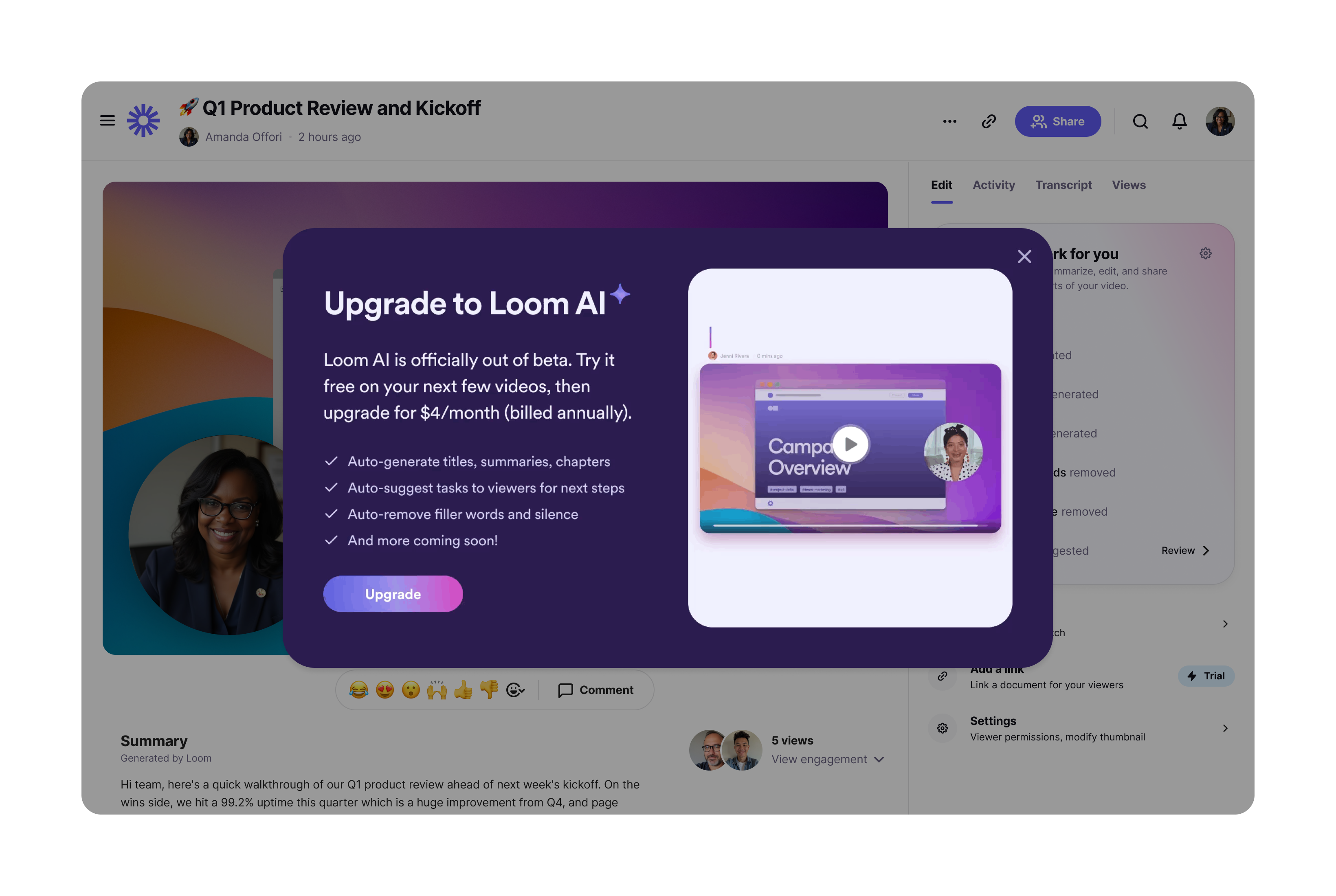
A modal over a Loom video page headed Upgrade to Loom AI, with the line Loom AI is officially out of beta, four benefits, and a single Upgrade button
The launch moment We believed Loom AI would matter, so the launch needed to feel like an event rather than a release note. Loom had no pattern for such moment, so I looked at what competitors were doing, designed one, and worked with Product Marketing and Creative on what it said. The copy opens with “Loom AI is officially out of beta,” which is directed to the users who had been using it free for weeks. It leads with the trial and the price information, and states the four benefits. This surface drove 40% of launch revenue.
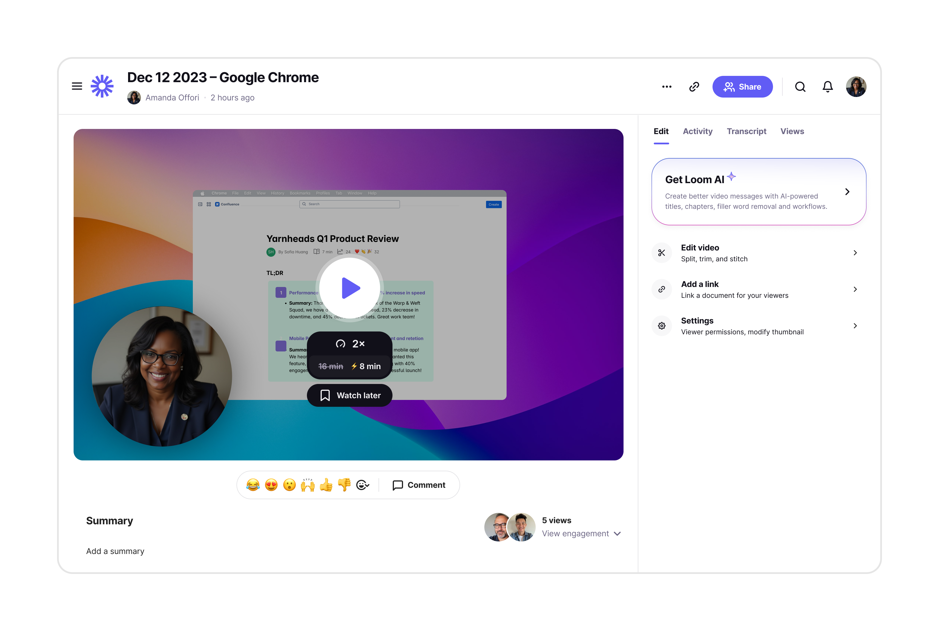
A Loom video page with a Get Loom AI card at the top of the right rail, above the Edit video, Add a link, and Settings tools
The way in Loom already had a paywall pattern and it did not work for these features, because AI was not one locked button but a set of capabilities scattered through editing and sharing. In collaboration with the Core team I designed a banner-style paywall that sits at the top of the rail rather than in front of any single feature, so the tools below it read as a preview of what you would get instead of a wall you keep hitting.
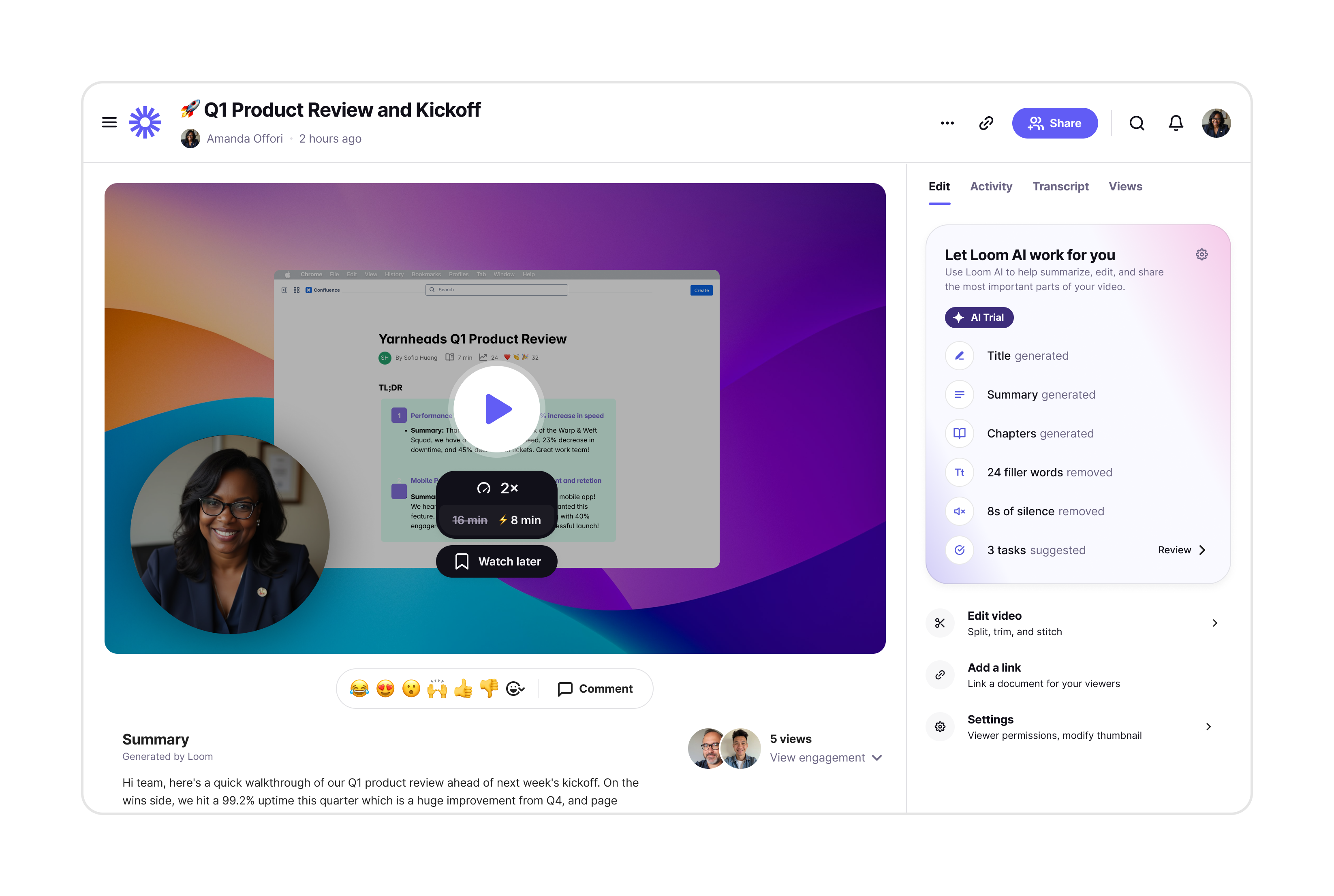
The Loom AI panel during a trial, headed Let Loom AI work for you with an AI Trial badge, listing title, summary and chapters generated, filler words and silence removed, and tasks suggested
During the trial The panel made legible what Loom AI did to the video – title, summary, and chapters generated, filler words and silence removed, tasks suggested. The trial was marked in the panel so the value of Loom was right in front of you.
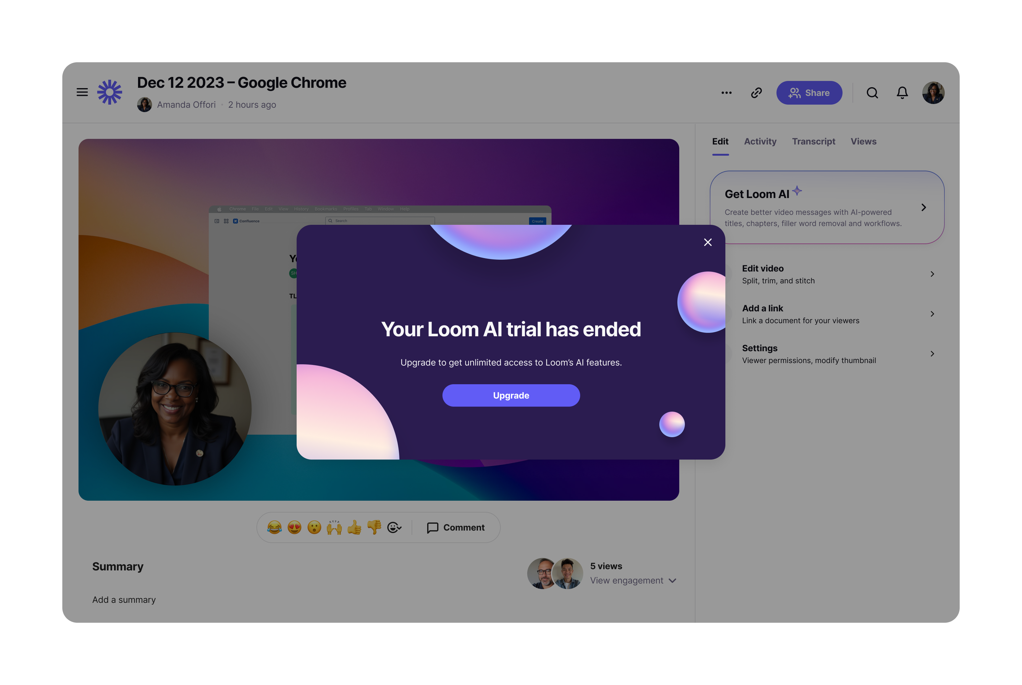
A modal over a Loom video page reading Your Loom AI trial has ended, with one Upgrade button
When it ends The end of a trial is the moment a user is most likely to convert. This says what happened and offers the one thing you would want next.
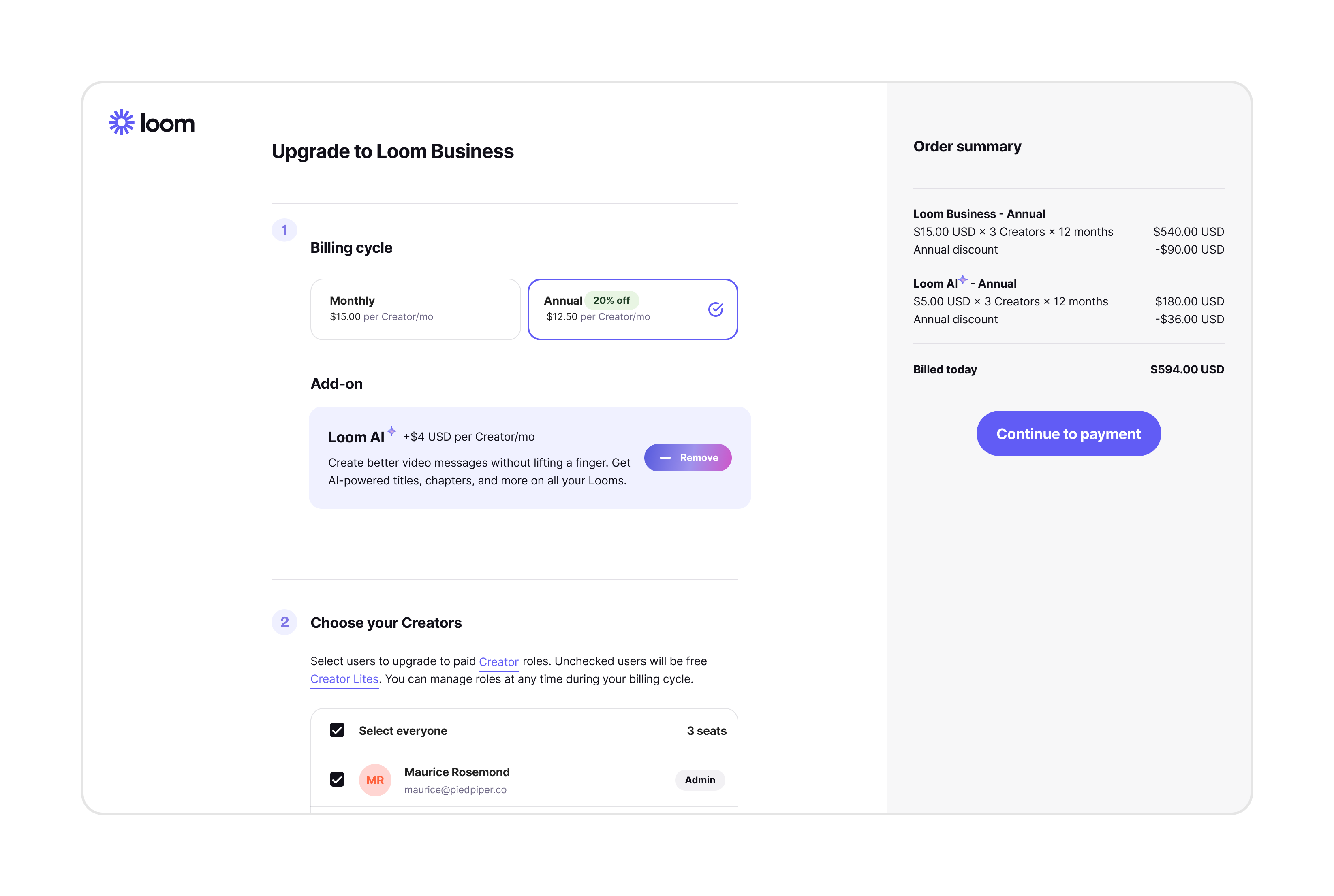
The Upgrade to Loom Business checkout with a Loom AI add-on already added and a Remove button, beside an order summary listing both line items
Checkout, with the add-on already in the cart The add-on sits inside the upgrade flow rather than after it. The order summary beside it updates as you go.
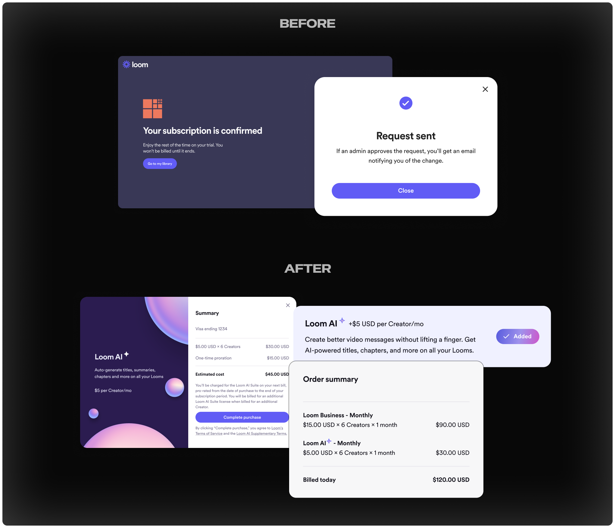
Before and after of the purchase surface: a generic subscription confirmation and request-sent dialog above, the Loom AI branded summary, add-on row, and order summary below
Before and after Before, buying AI looked like any other subscription event. After, the sub-brand Creative had built for marketing carries all the way through to the surface where money changes hands, so the product and buying experience are cohesive.

What happened

40%
of launch revenue came through the launch modal
+7%
video-first views in beta, the largest engagement gain of the period

How it got there

A successful beta that made no money

Loom AI was approaching general availability. The beta had been hugely successful, driving the largest engagement gains the product had seen, but none of it was translating into revenue yet. My team was brought in to solve that, with a mission to design and launch an add-on package.

Testing hypotheses to build the package

We knew we were building an add-on. Almost nothing else was settled: which features were in it, which user types could buy it, or how it sequenced against the core launch. We used painted door and A/B tests to put options in front of users, gather data, and make iterative decisions on packaging and launch.
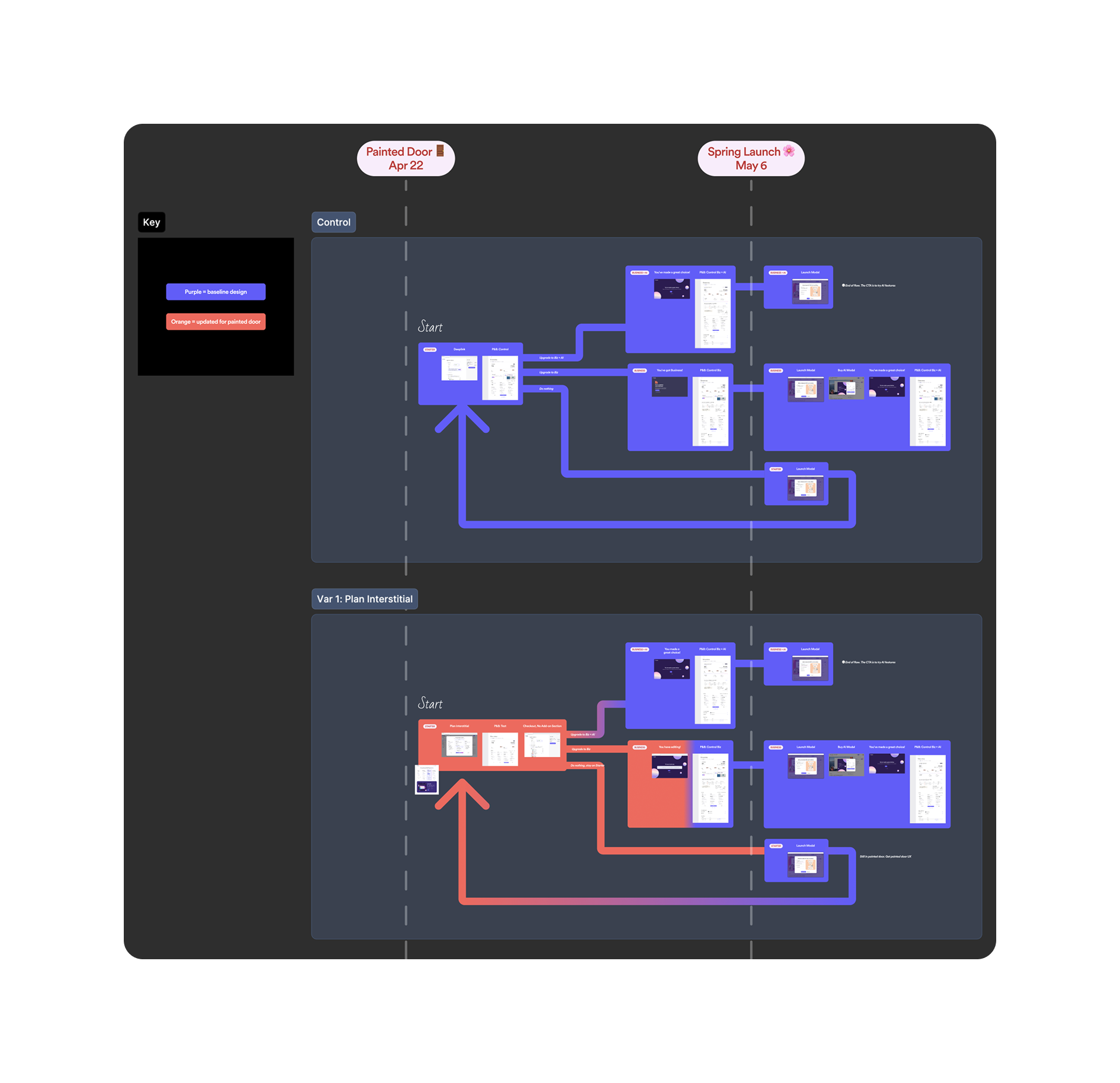
A dark board comparing the control flow against the plan interstitial variant, with every branch drawn between the painted door date and the spring launch date, purple for baseline and orange for what changed
Control against one variant, every branch drawn A painted door test before a packaging launch. Control and the plan interstitial variant, with every path a user could take through each: upgrade to Business and AI, upgrade to Business, do nothing. Purple is the baseline design and orange is what changed for the test, so anyone could see at a glance exactly how much we were altering and where.

Designing next to an AI team

The commercial side of an AI product is not separable from the product side. I was designing how people would meet and pay for these features while the core team was still settling what the features would do, which meant the two shaped each other week to week.

  • What you can build determines what gets packaged. The core team deciding which features were scoped into launch impacted where the add-on boundaries fell.
  • The AI features are difficult to paywall the usual way, leading to the new banner pattern above.
  • Loom’s trials had always been time-based. This one metered videos, which meant new patterns for showing what you had left and what happened when it ran out.

What I took from it

The design system is a tool, not a rule

Like any tool it should be used critically. On this project we departed from the system deliberately, because the existing paywall pattern could not support what we needed. The departure and incorporation of an exciting sub-brand into the product ended up driving revenue.

Design became the source of truth

This launch pulled in product, core, marketing, and data. With that many moving pieces people needed one place to check which features shipped, in which package, and in what order. People came to rely on design files as a source of truth, because diagrams were faster to interpret than docs.